

The Bear Mountain Brand Book
Summary
In Spring 2022 as part of my Graphic Design II course, I created a comprehesive brand book for a local company in College Station, TX, called The Bear Mountain.
During the 3 weeks, I used the existing brand to draw inspiration upon for the logo, typography, color palette, business cards, and packaging. I learned to develop branding for an existing company and to make sure that the refresh still aligns with the company’s vision.
Role
Graphic Designer
Tools
Tools: Adobe Illustrator, Adobe InDesign, Adobe XD
Brand Book


Design Process
01
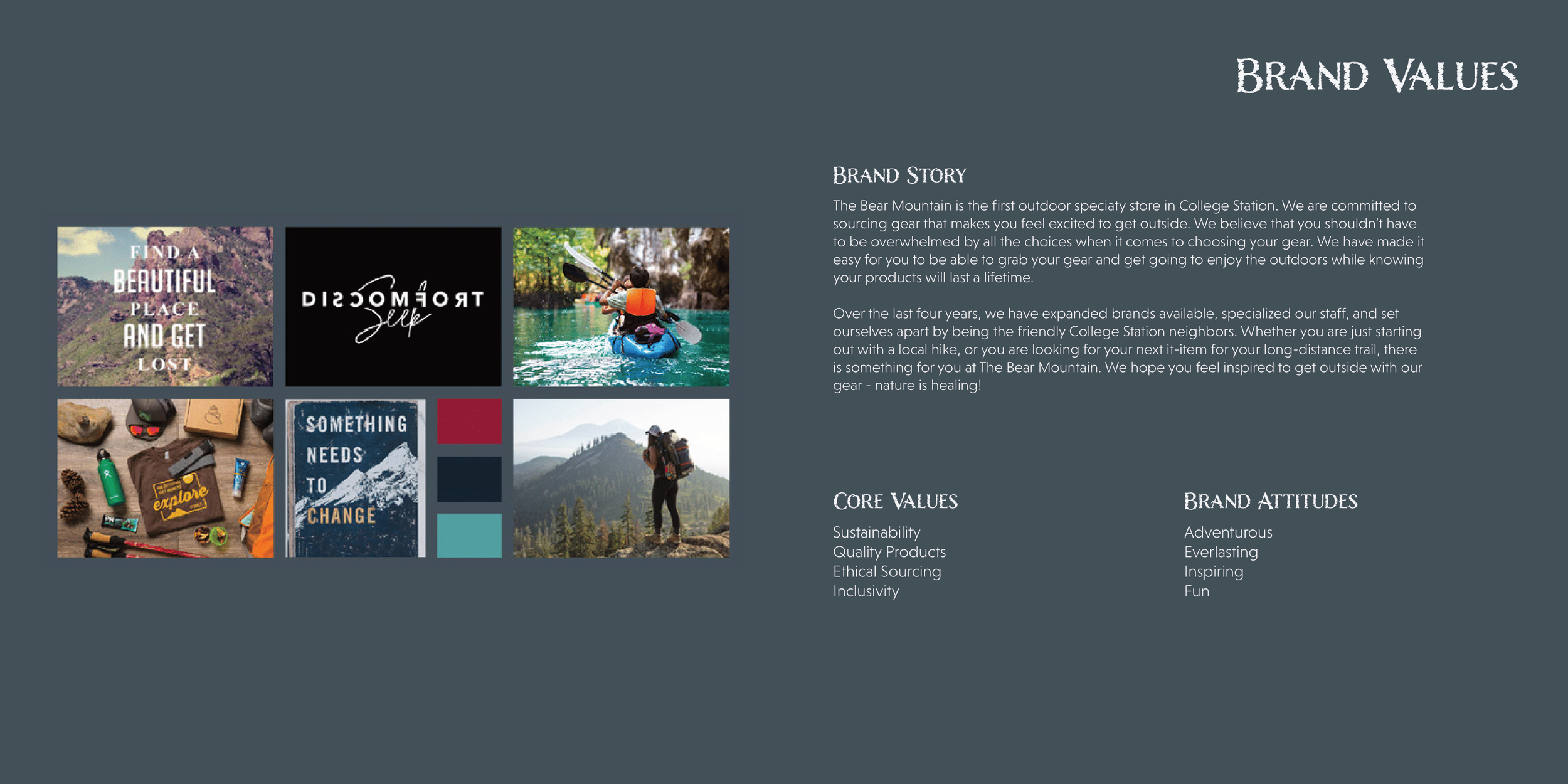
Brand Values & Moodboard
While keeping true to The Bear Mountain’s identity, I decided to build upon it to create Core Values & Brand Attitudes. Additionally, I created a moodboard, which I used throughout the process to remind myself to invoke the same emotions that the images do.
Brand Story
The Bear Mountain is the first outdoor speciaty store in College Station. We are committed to sourcing gear that makes you feel excited to get outside. We believe that you shouldn’t have to be overwhelmed by all the choices when it comes to choosing your gear. We have made it easy for you to be able to grab your gear and get going to enjoy the outdoors while knowing your products will last a lifetime.
Over the last four years, we have expanded brands available, specialized our staff, and set ourselves apart by being the friendly College Station neighbors. Whether you are just starting out with a local hike, or you are looking for your next it-item for your long-distance trail, there is something for you at The Bear Mountain. We hope you feel inspired to get outside with our gear - nature is healing!
Core Values
Sustainability
Quality Products
Ethical Sourcing
Inclusivity
Brand Attitudes
Adventurous
Everlasting
Inspiring
Fun
Moodboard
02
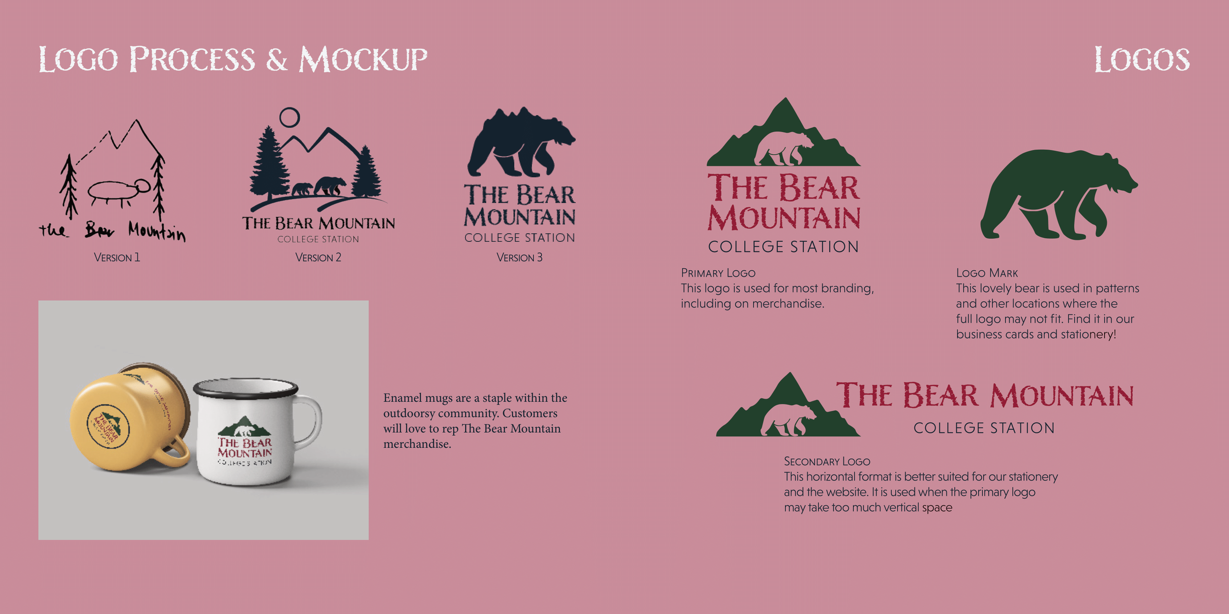
Logos
Upon inspecting the current logo, the mixture of watercolor effects and thick lines read as overwhelming and clashy. Additionally, the Papyrus font utilized is a bit outdated. After iterating many times from rough sketches on paper and then building various versions in Adobe Illustrator, I landed on the final logo. After the primary logo, I built the secondary logo and logo mark.
Original Logo
Initial Sketches
Digital Sketches
Final Logos
Primary Logo
This logo is used for most branding, including on merchandise.
Secondary Logo
This horizontal format is better suited for our stationery and the website. It is used when the primary logo may take too much vertical space.
Logo Mark
This lovely bear is used in patterns and other locations where the full logo may not fit. Find it in our business cards and stationery!
03
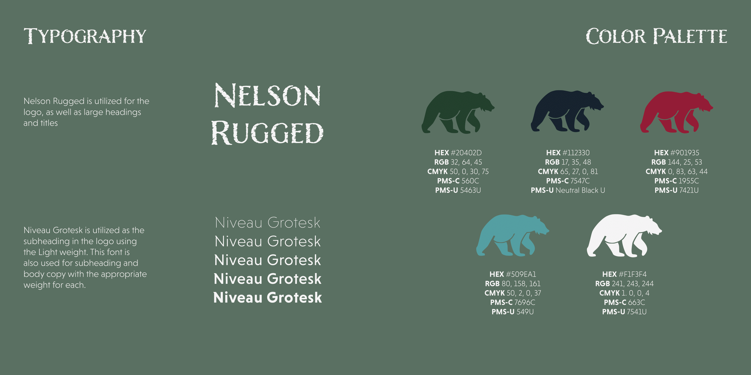
Typography & Color Palette
The original logo utilized Papyrus, which is outdated and often associated with the Avatar movie. For the new typography, I chose Nelson Rugged, which is fresher and still evokes the outdoorsy feel. For the secondary typeface, I chose Niveau Grotesk as a complementary sans-serif typeface.
The original color palette used black, white, and grey. However, that does not represent the vast greenery and other elements of the outdoors. With the new color palette, that is what I aimed to elicit.
Original Typography & Color Palette
New Typography
Nelson Rugged is utilized for the logo, as well as large headings and titles
Niveau Grotesk is utilized as the subheading in the logo using the Light weight. This font is also used for subheading and body copy with the appropriate weight for each.
New Color Palette
04
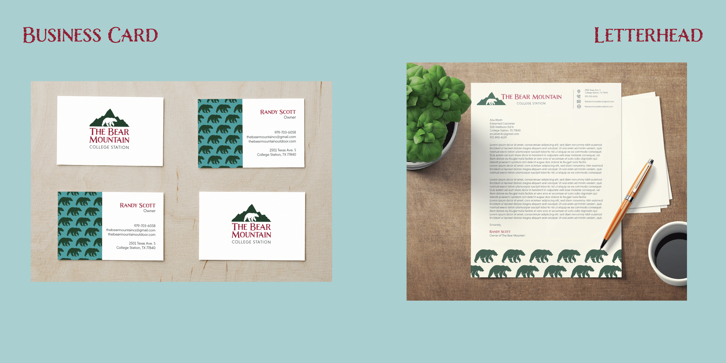
Mockups
In order to visual the logo and the rest of the branding, I mockup’ed business cards, a letterhead, and a enamel mug, which is commonly used during camping.
Business Cards
Letterhead
Enamel Mug

05
Website & Mobile Redesign
Of course, the website (desktop & mobile) would need to adopt the new branding, so I created some mockups of the site. I kept the information about the company but also brought in more about brands that they carry in store. I also added further information in the footer to follow common design standards, and it made the information easier to view.
Desktop
The top portion is made to grab the attention of the viewers since it shows some of the gear that The Bear Mountain offers in action.
The main section highlights the goals of the store, as well as some big name brands that would entice outdoorsy folk to come and visit the store.
The footer includes information about the store, such as operating hours and links to their social media.
Mobile
Lessons Learned
Refreshing an Existing Brand
Although this refresh was not presented to The Bear Mountain, I learned a lot about using existing material to inspire new designs while still staying true to the values of the company.
Accessibility
With the knowledge I have now, I would choose a white font on the teal background for the website as that would have greater contrast.
Design Standards
The web page I currently have is a bit cluttered with the colors for each section. In a future iteration, I would choose to either reduce the saturation of the colors or opt for using the colors in the text instead of the blocks for better viewability.