

Enhancing the Assessment Experience for SDLC Standards at UWM
Summary
As part of my UX Design internship at United Wholesale Mortgage (UWM), my partner and I redesigned the application that IT coaches within the Center of Excellence (CoE) use to measure the maturity of development teams in relation to Software Development Life Cycle (SDLC) standards set by the industry and UWM. We researched the experience for teams completing assessments and how coaches communicate with teams. I collaborated with the UX research team, UX design team, UX writing team, the product owner, and other stakeholders to create a high fidelity prototype that supports teams completing assessments, receiving coach feedback, and viewing progress metrics. The redesigned application will lead to increased support for development teams to align with SDLC standards, resulting in more cost-effective and time-efficient development.
Role
UX Researcher, UX Designer
Methods & Tools
Methods: Content Inventory + Audit, User Interviews, Observations, Affinity Diagramming, User Flows, Wireframing, Prototyping
Tools: Figma, FigJam
Process Overview
Empathize
Define
Ideate
Prototype
Test
Introduction
Background on the Center of Excellence (CoE)
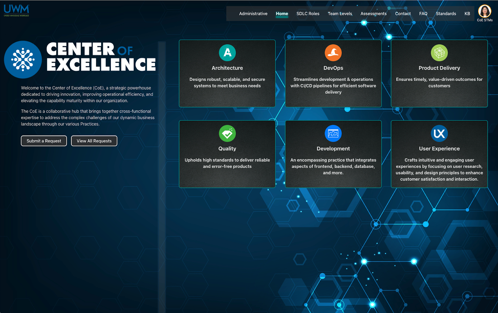
The Center of Excellence (CoE) is an organization within United Wholesale Mortgage that “promotes quality-driven solutions and outcomes through team empowerment, continuous improvement, and standard practices.” They aim to help IT teams better adhere to industry and UWM standards for development in the Software Development Life Cycle (SDLC) so that teams can develop via more cost-effective and time-efficient methods.
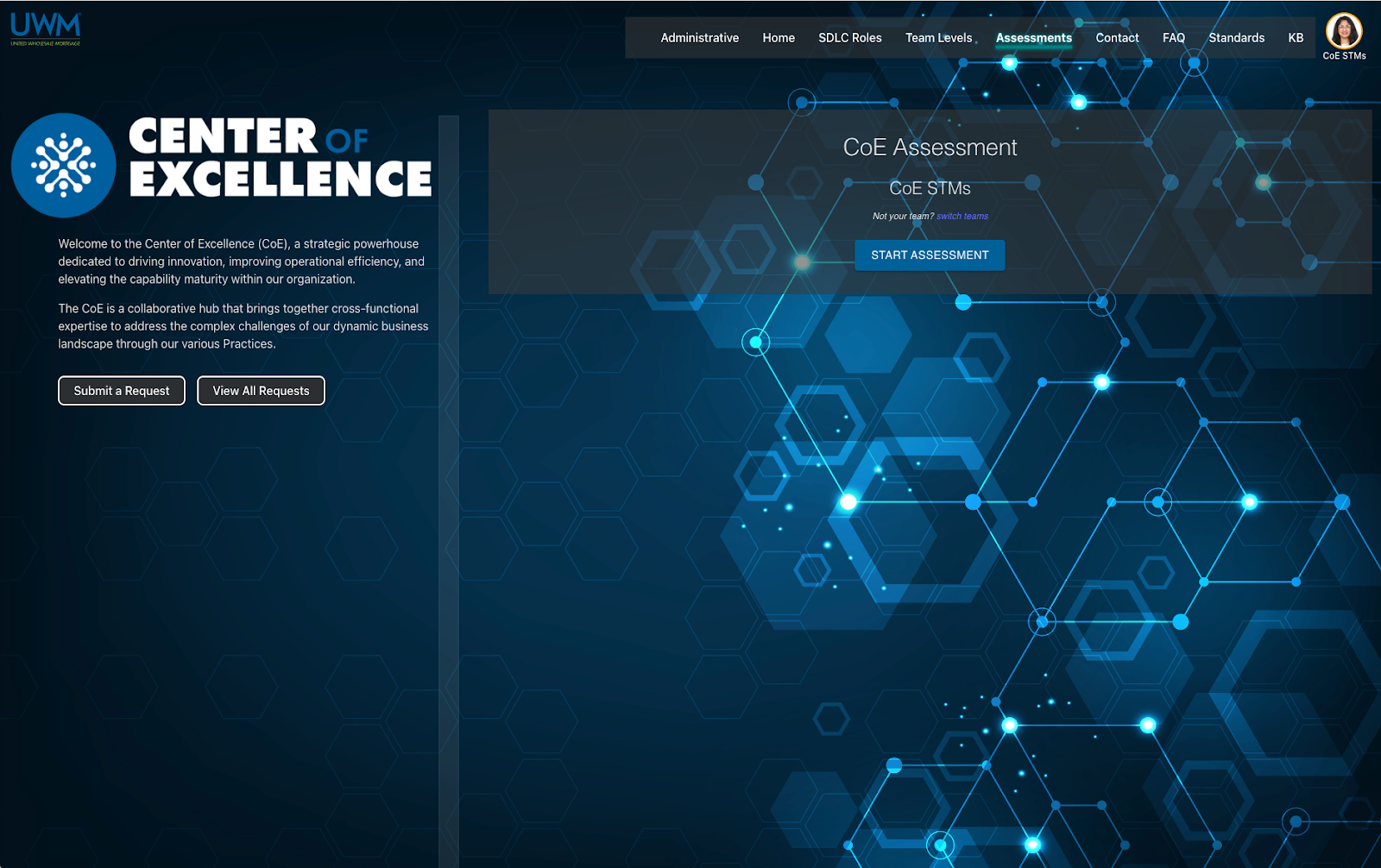
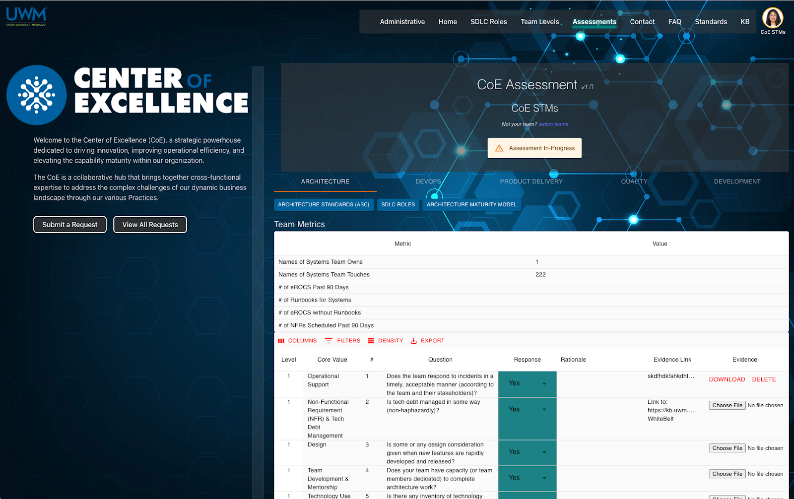
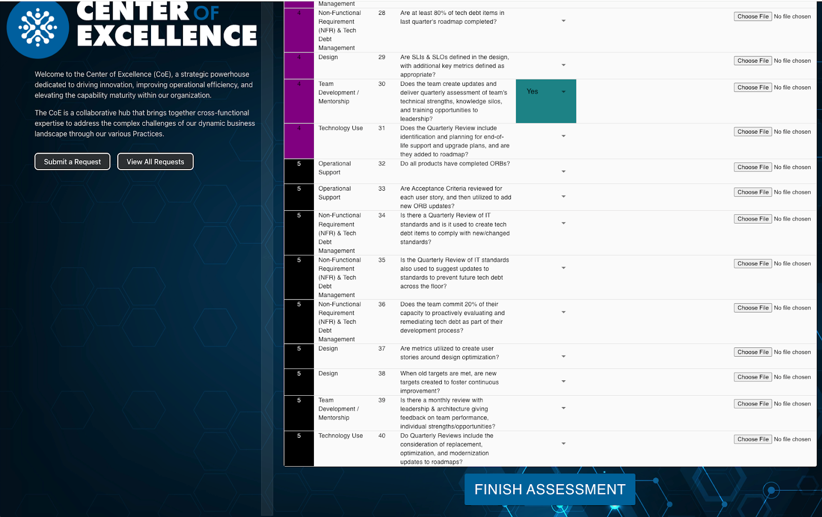
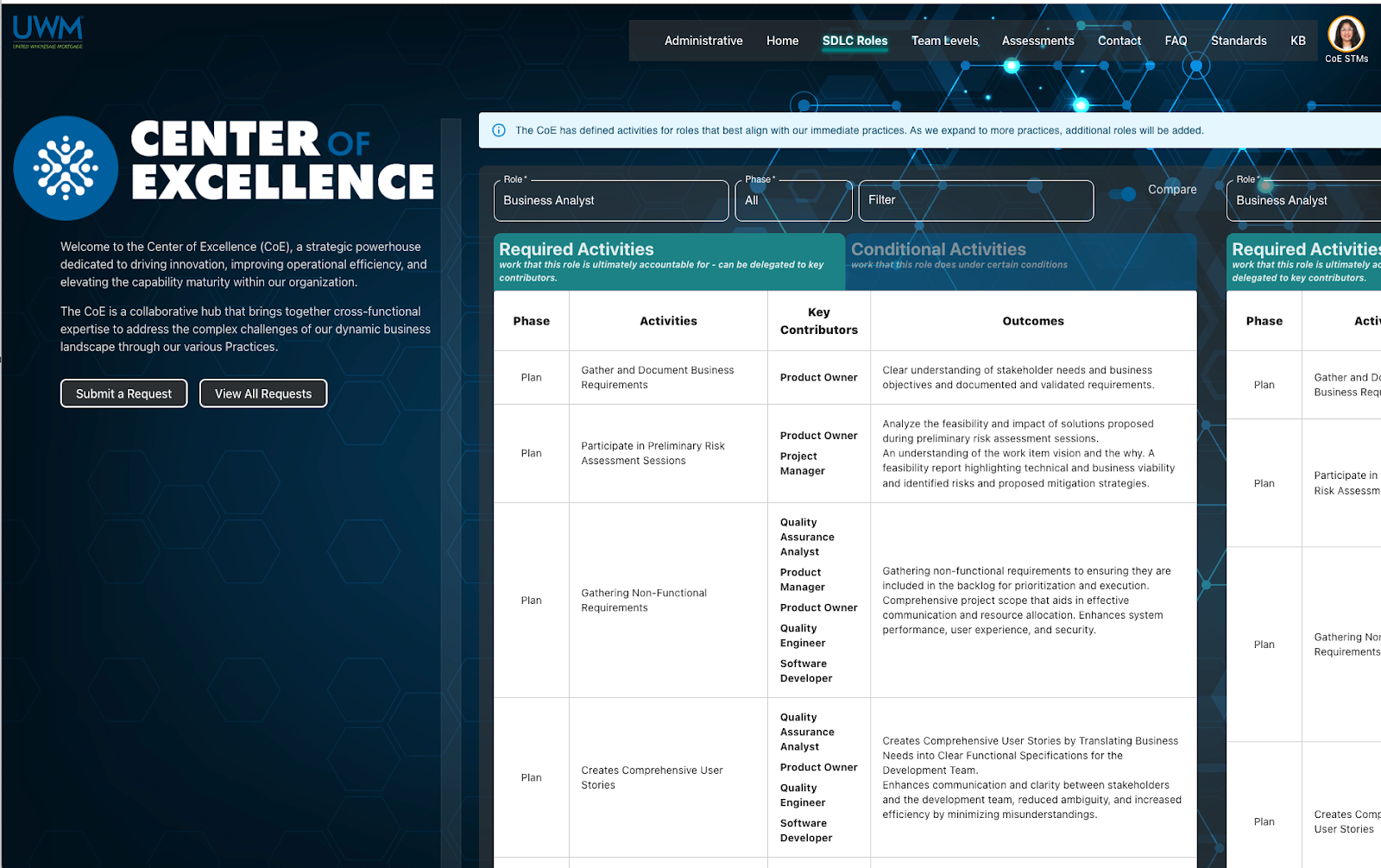
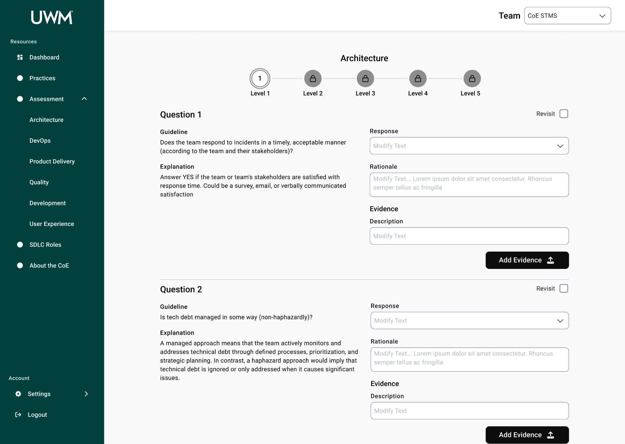
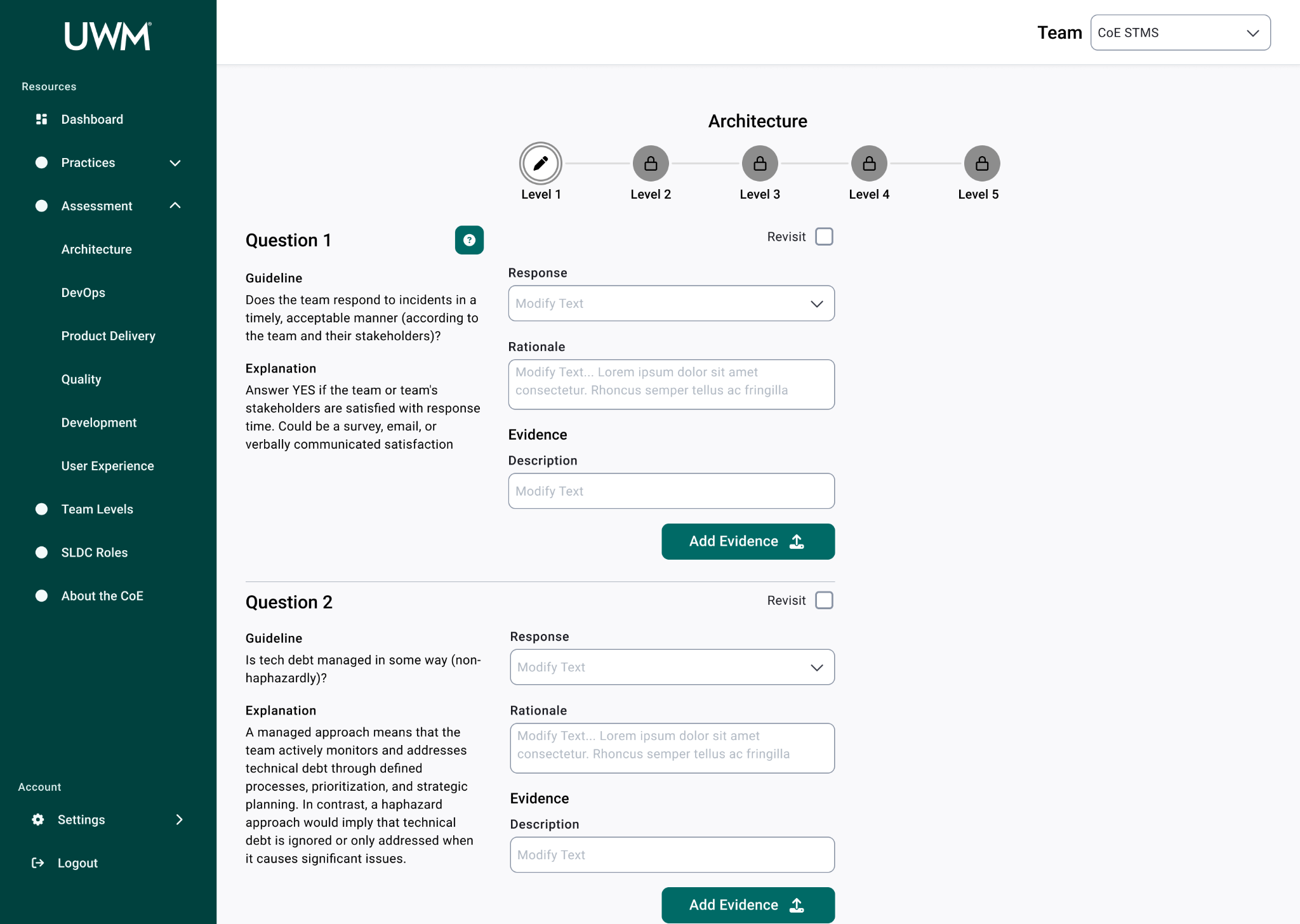
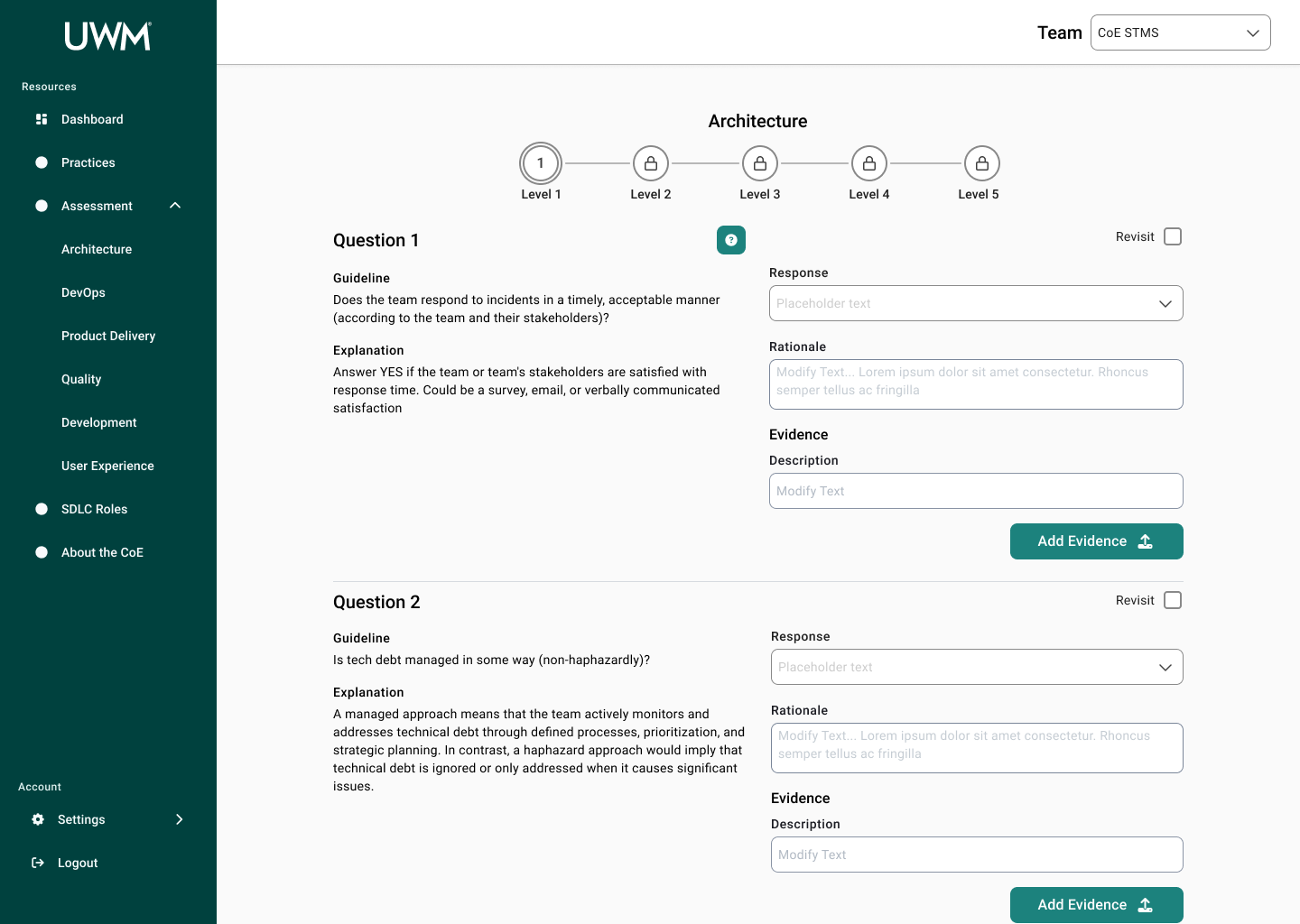
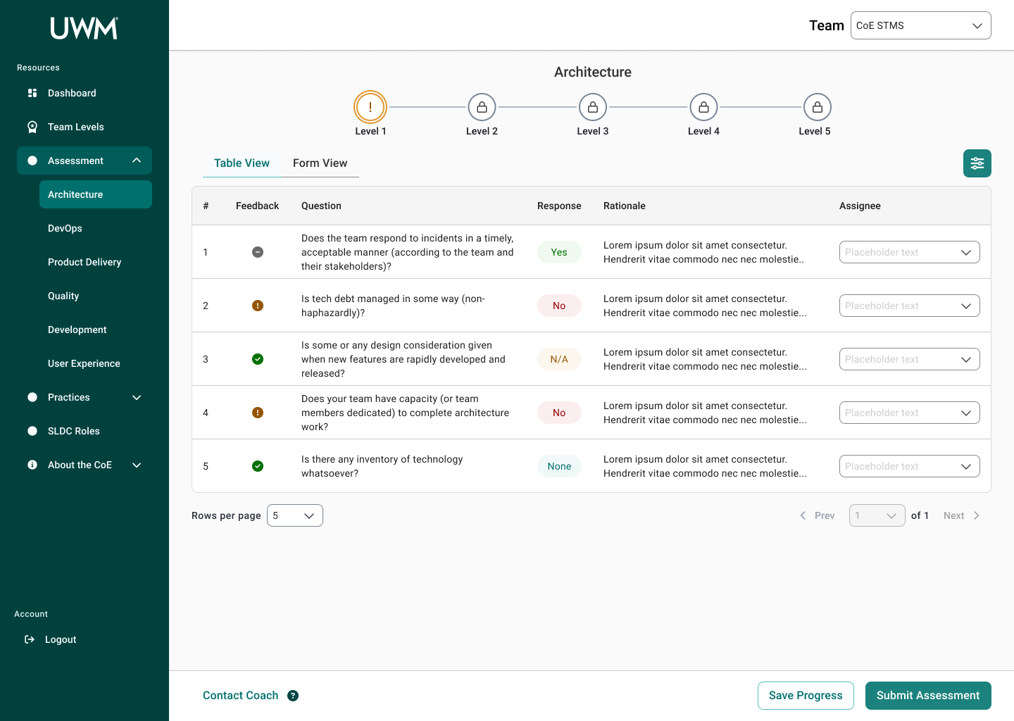
IT teams complete assessments on the CoE page to determine their maturity by providing relevant evidence. Assessments are broken up into 5 practices, including Architecture, DevOps, Product Delivery, Quality, and Development. CoE coaches for each practice then provide feedback and aid teams accordingly to develop better practices.
Objective
As the team developed the initial site very quickly, they did not collaborate with the UX team nor implemented UX best practices, resulting in teams completing assessments having difficulty and feeling like a cumbersome task.
For the duration of our internship, my partner and I were tasked with redesigning the Assessments and SDLC Roles pages. We incorporated UX considerations, as well as aimed to improve the communication gap between teams and coaches. Lastly, our design should utilize the new company design system, Dream, to align with other products.
Current State

Final Deliverables
Design Process
01
Empathize
I began the process with a content inventory to understand the pages’ current state as well as familiarize myself with the CoE. Once I completed the content inventory, I went more in depth with a content audit to evaluate for industry best practices, including chunking, contrast, formatting, and structuring. I used the audit as a way to identify ways users may face difficulty using the application. I also noted next steps from the audit, which I used for the pages we would be focusing on in the research phase.
Key Audit Findings
Poor visual hierarchy throughout
Large swaths of information not broken into consumable sizes
Low contrast between background and text on all pages, largely due to the background image used
Research Questions
Based on the stakeholder ask, we formulated research questions that guided our process:
What do people know about the CoE?
Why do these teams continue using the CoE app?
Why do these teams have low engagement with the CoE?
What usability issues do individuals face?
What is their motivation for achieving these standards, and how do users feel about the gamification element? Namely, the badges and belts.
Research Methodology
Participants
| Participant # | Role |
|---|---|
| 1 | Scrum Master |
| 2 | Team Lead |
| 3 | Scrum Master |
| 4 | Scrum Master |
| 5 | Team Lead |
Within IT teams, scrum masters and team leads are tasked with completing the team’s assessment, so we recruited them as participants. For diversity, we chose to recruit from teams with varying levels of maturity, as well as the product they are working on. Later in the process, the scope was increased, so we also interviewed coaches who are on the other side of the assessments.
Interviews
We chose to conduct semi-structured interviews, which allowed us to learn more about their experience while probing as necessary. We chose to ask general open-ended questions, and then we ended with walking through each of the pages to refresh their memory and allow them to comment on any issues they had.
Observation
In addition to interviews, we observed a development team working on leveling up their maturity, which entailed answering questions for the next level in each practice. Through the observation, we identified key usability issues that we would not have foundhad we done just interviews.
After the observation, we also met with the scrum master to ask follow up questions to understand what we had observed.
02
Define
Data Analysis
We utilized affinity diagramming to process the notes from the interviews and observation. We organized the findings by page, as well as strengths, pain points, opportunities, and insights for each page.
After organizing our findings, we identified key implications for design that we would focus on during the ideation phase.
Key Implications
Assessments Page
Responsiveness Issues
All users cited difficulties inputting their responses and evidence due to space and wrapping issues. A view with more responsive inputs and more space would allow users to answer the questions more efficiently.
Question Misinterpretation
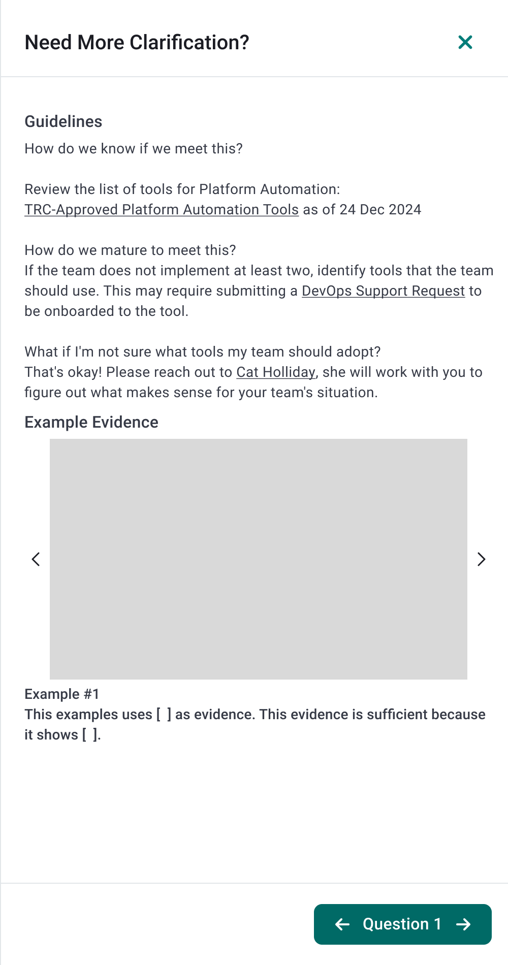
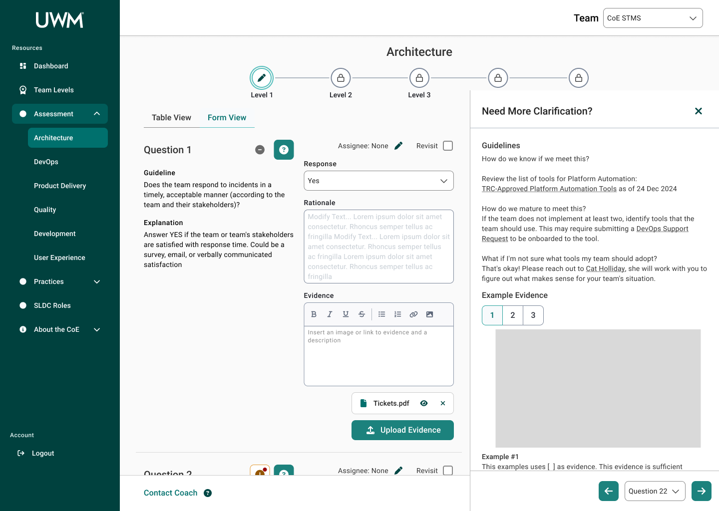
Several users struggled with interpreting the questions listed, including if they met the metric and what would be applicable evidence. Some users were not aware of tooltip hover information for the questions nor the resource pages, which often varied by each practice depending on the coach. A centralized and standardized method for sharing additional information for each question would allow users to answer the questions with less uncertainty.
Communication Gap
Due to the decentralized process of coaches providing feedback to teams, communication between them would be prolonged or lost. Having coach feedback centralized in the application would allow users to receive the feedback and resubmit as necessary with all information together.
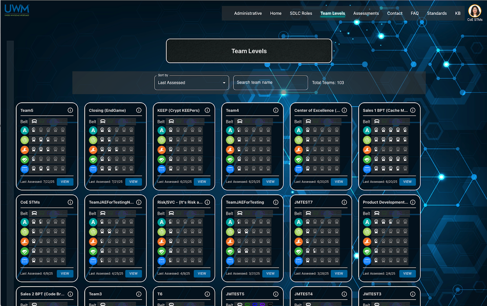
Team Levels Page
Difficulty Switching Views
Users can only see the team they are currently on, housed in the profile section, where they would have to manually switch to another team. For team members, such as scrum masters that would be part of multiple teams, this is cumbersome. Having the ability to change teams easier would allow users to view information and complete assessments quicker..
Gamification Confusion
Most users didn’t understand the purpose of the gamification elements on the page and couldn’t tie the badges to progress. A team level view with better progress visibility would allow users to understand their team’s maturity for SDLC standards.
Overall Experience
Necessity for Different User Roles
While coaches and teams utilize the application in different ways, the current set up has both parties viewing the same thing. Based on our research, we realized the teams and coaches should have different views of the application. From here, my partner and I branched, where I continued the team view for assessments, and they focused on the coach view.
03
Ideate
User Flow
Once we defined the key design implications, I created a user flow for the process a team member would take to complete an assessment. While this did not end up being the exact process followed in the final design, creating the user flow helped me understand how I could further improve the process.
Whiteboarding
I did whiteboarding sessions where my partner and I ideated on ways to organize the large swaths of information each page would need to hold.
Sketching
I sketched many iterations for each of the pages to explore different options cheaply and quickly.
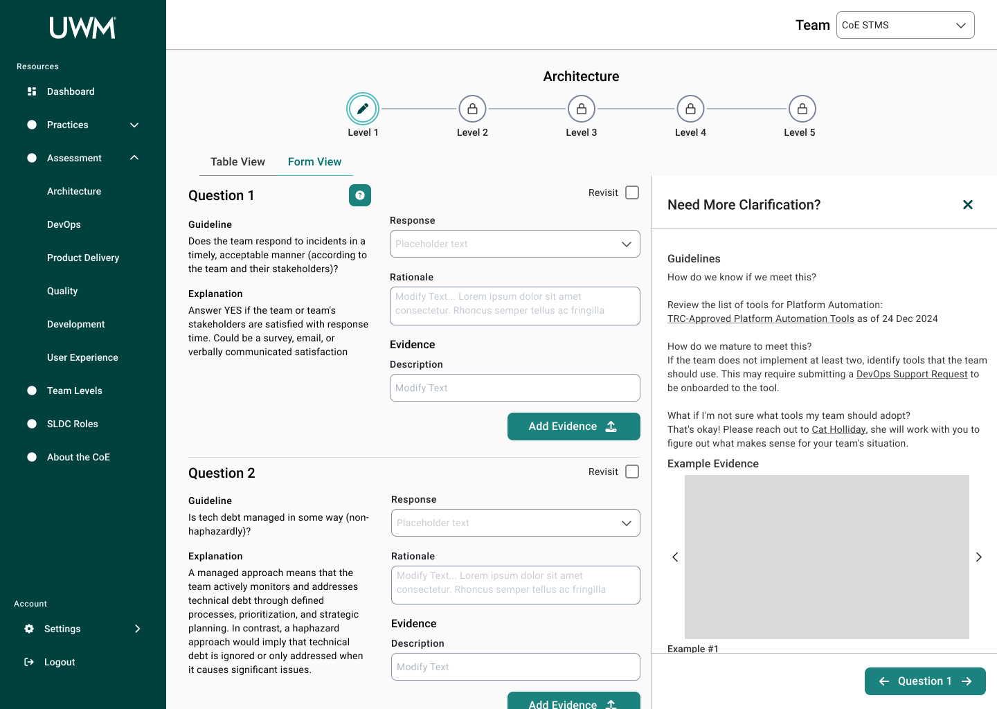
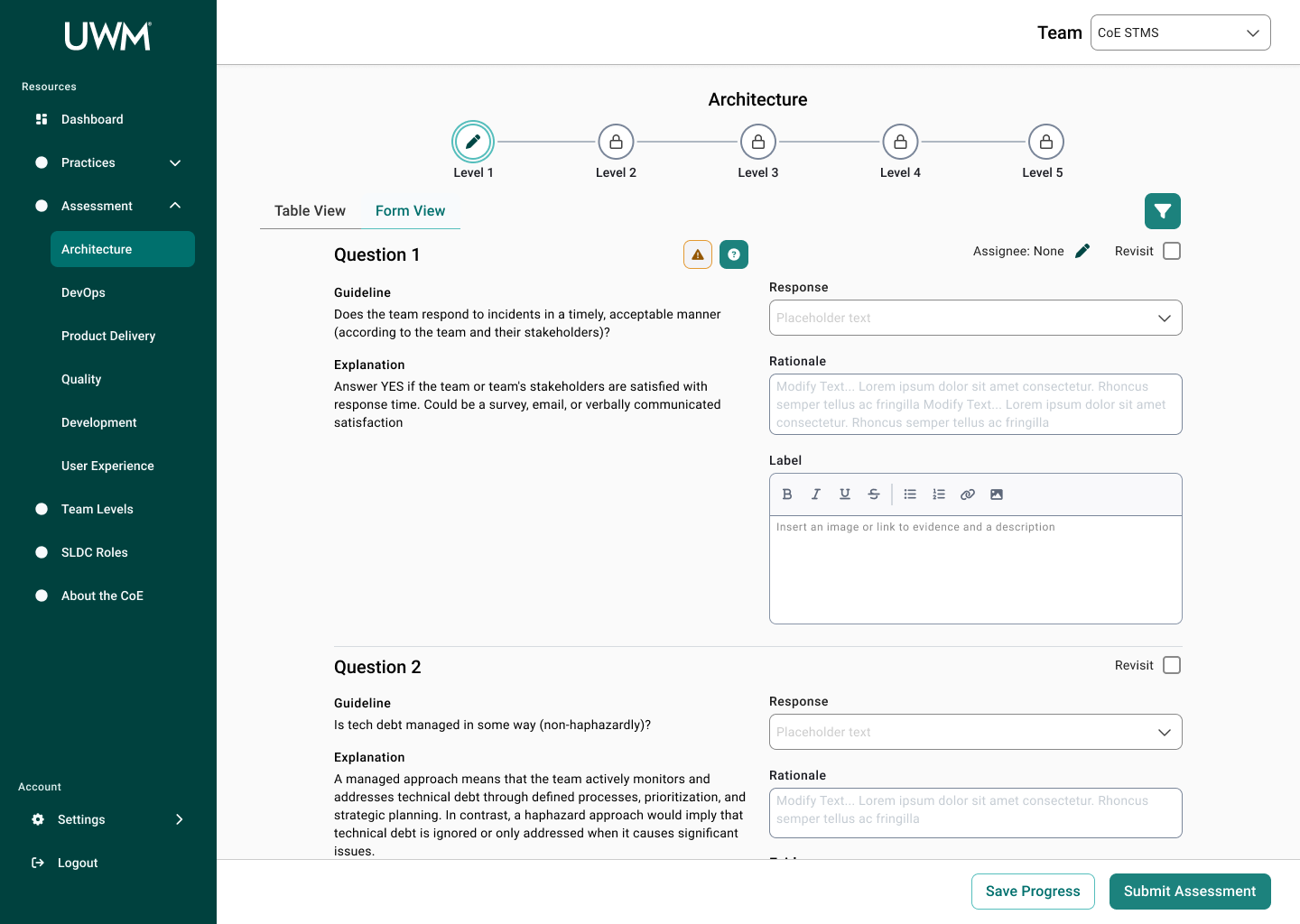
Assessment Page
Question Block
Assessment Home Page
Information Drawers
SDLC Roles Page
04
Prototype
Because I was working with an existing design system, I began by looking at the design library and guidelines to see what components I could use for the design. Between each iteration, I collaborated with the design system team and stakeholders to make sure the solution aligned with the stakeholders’ goals and adhered to the design standards.
Iteration 1
Key Changes
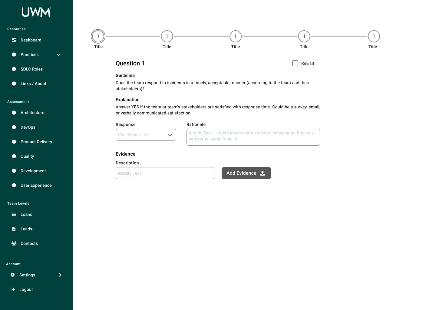
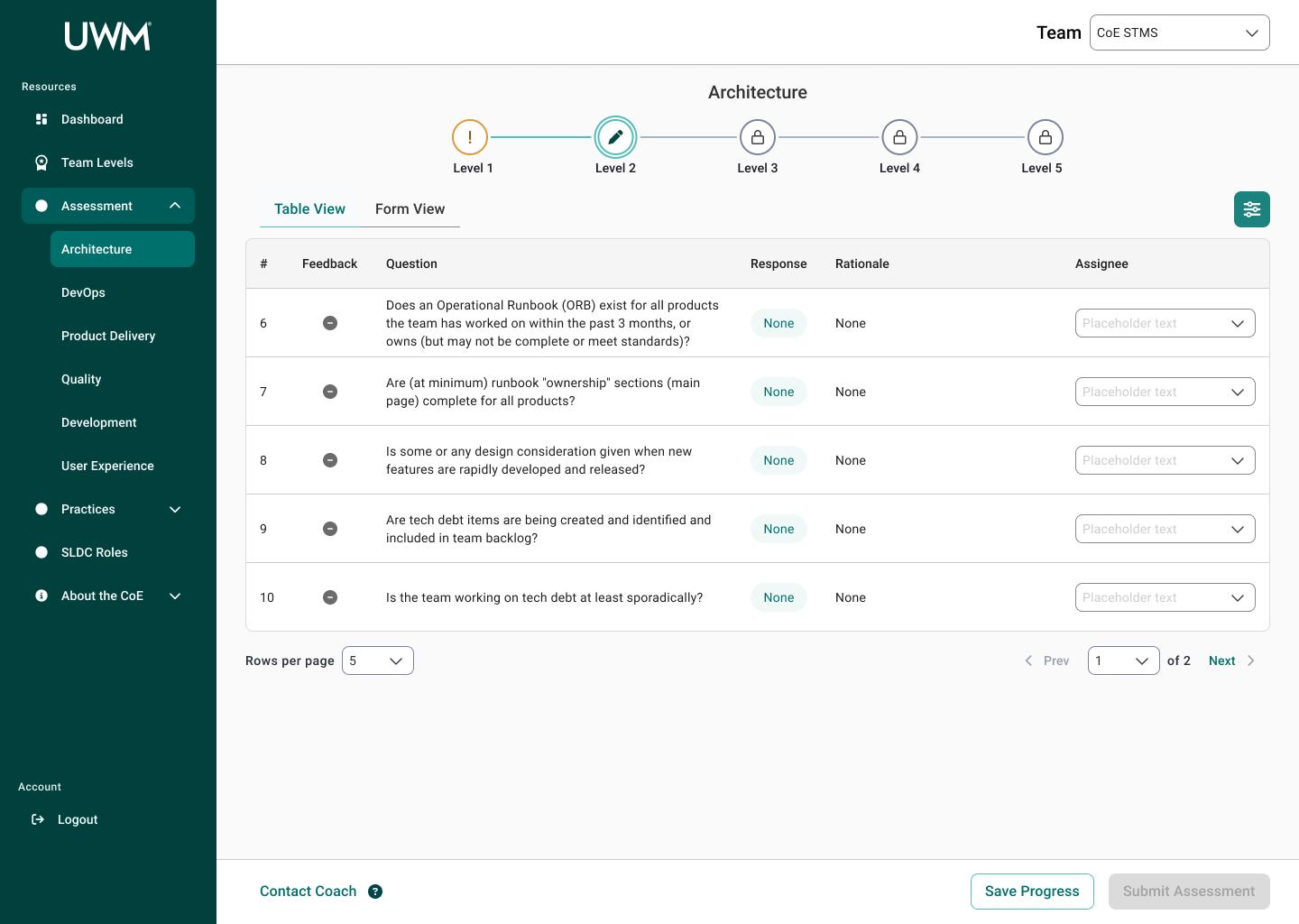
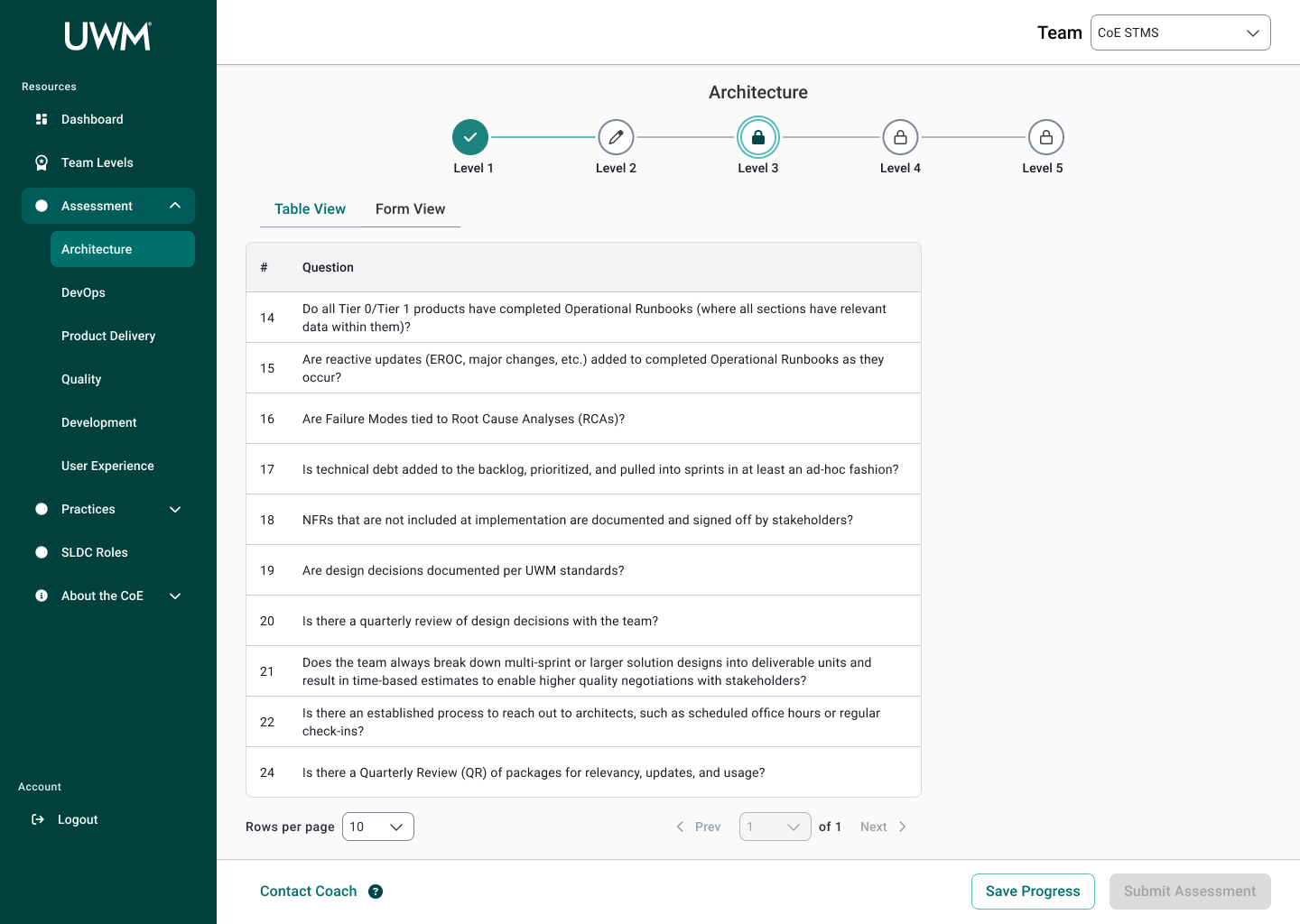
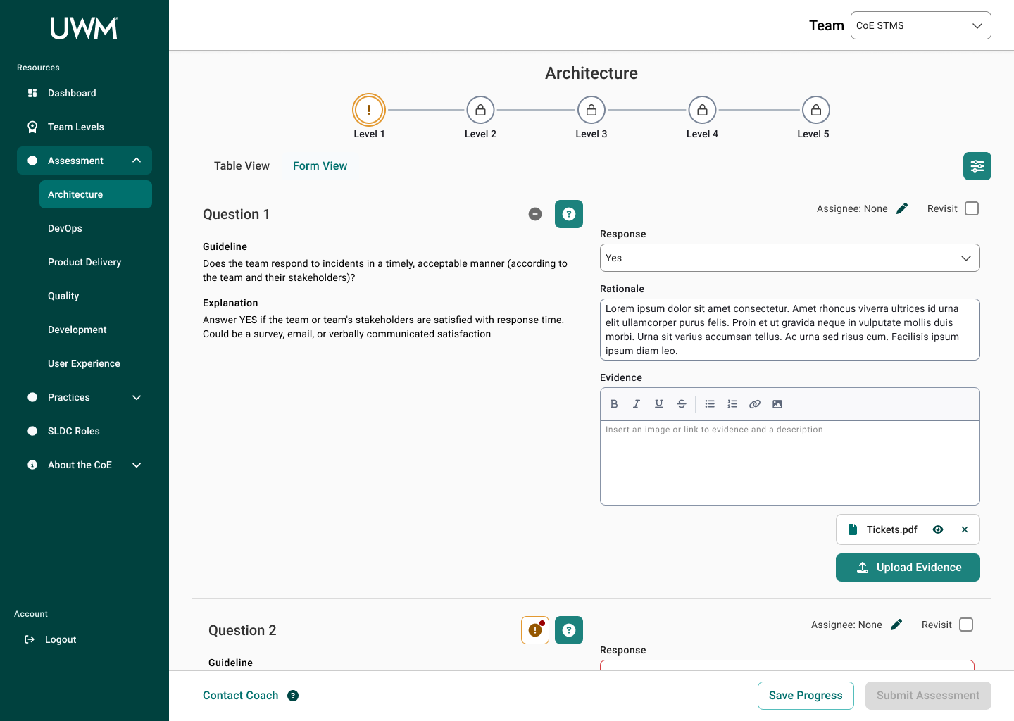
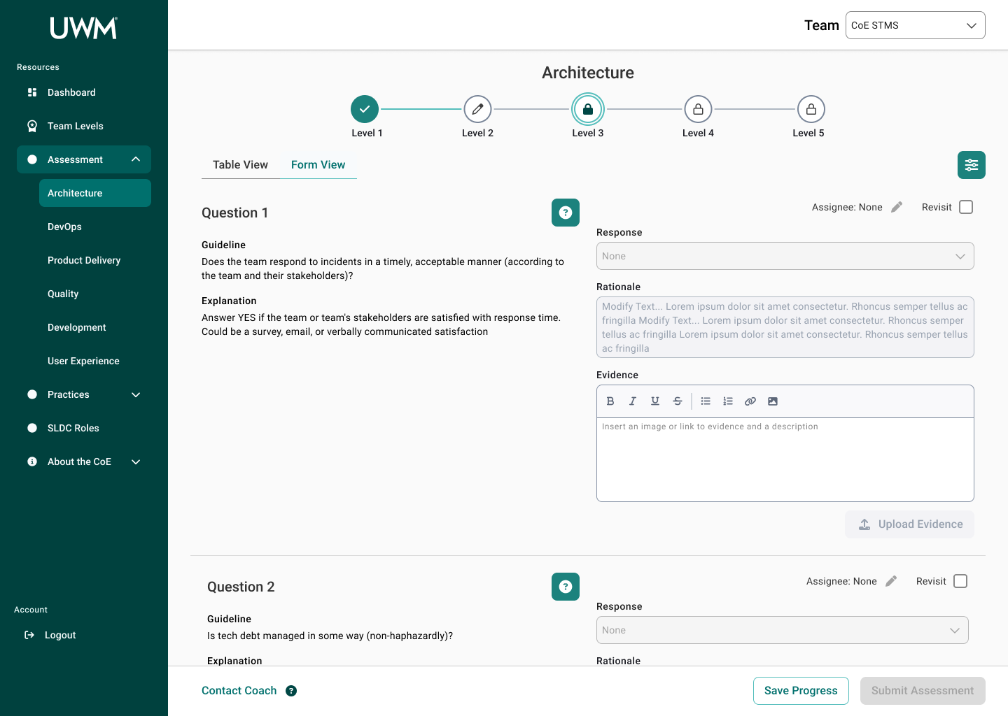
Stepper to Separate Levels - allows for chunking information and progressive disclosure
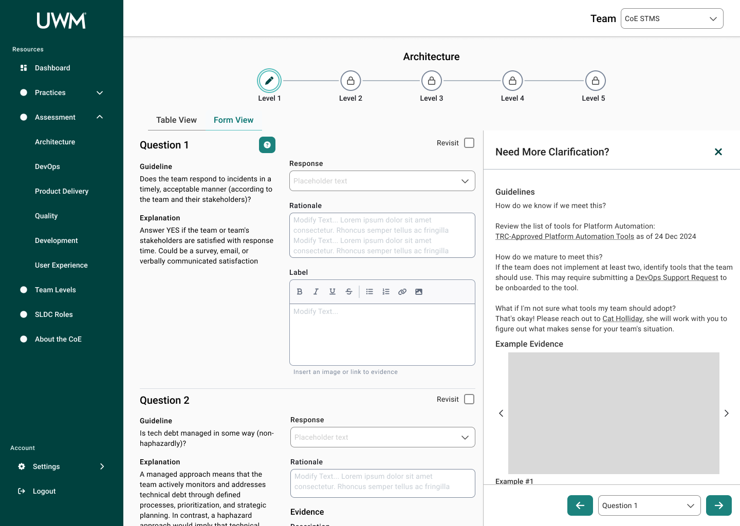
More Input Space - larger rationale and evidence space that wraps
Static Information - removing tooltip hover and making the information static to improve visibility
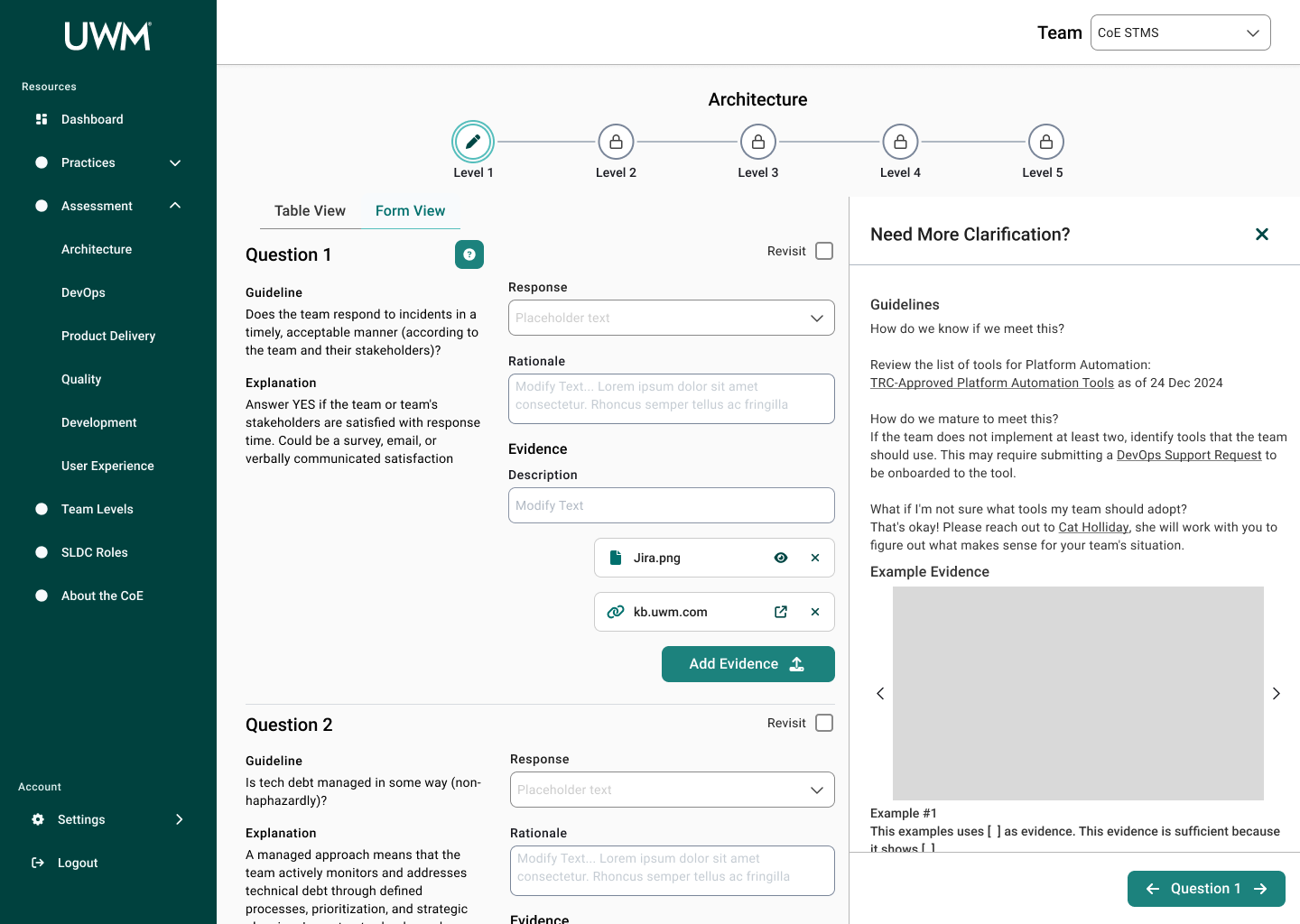
Information Drawer - for information that previously lived on other resources’ web pages, the drawer keeps it on one page and allows to view while editing responses
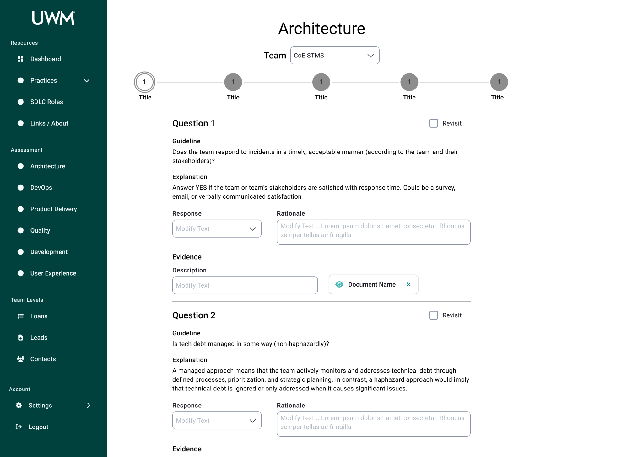
Iteration 2
Key Changes
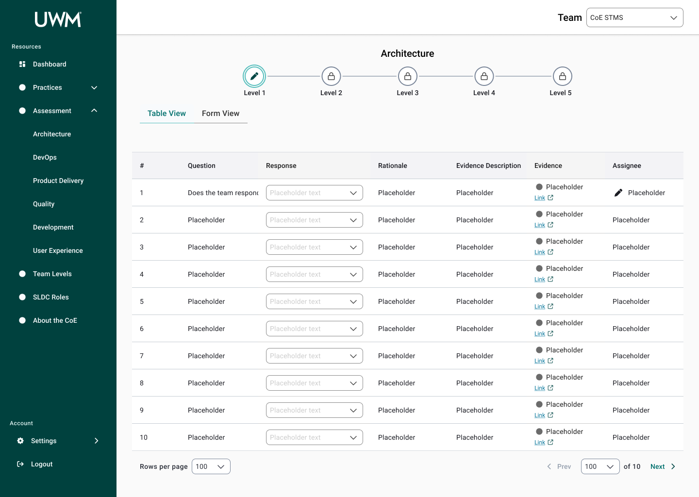
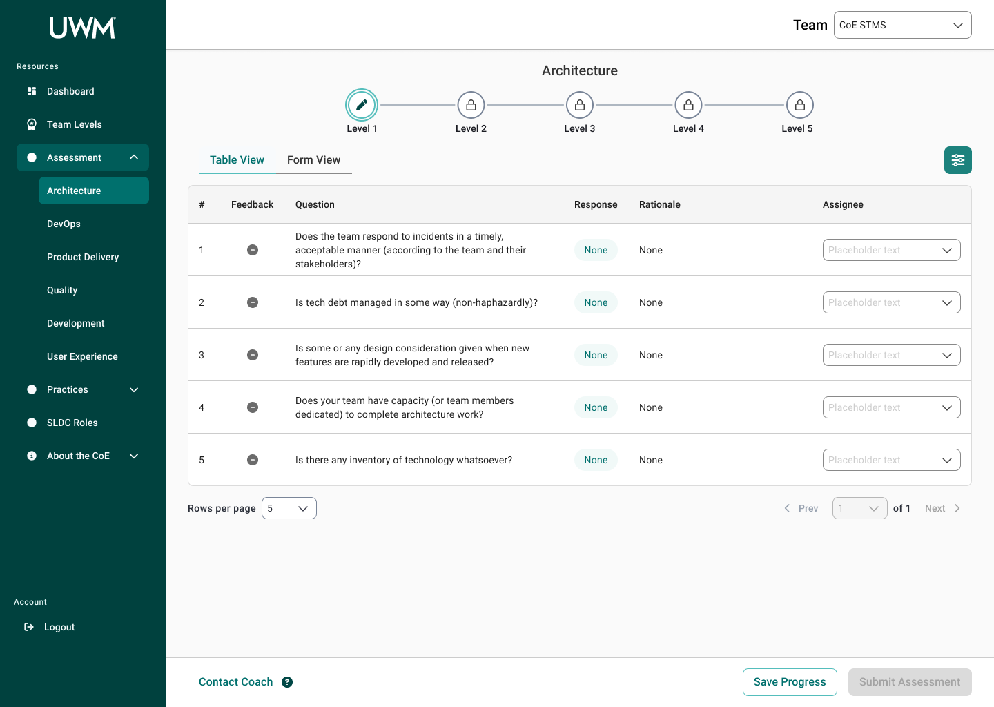
Two Views: Table & Form - Table View for an overview of questions and responses and Form View for filling out responses with ample space
Iteration 3
Key Changes
Table View Information - pared down what is viewable in this tab
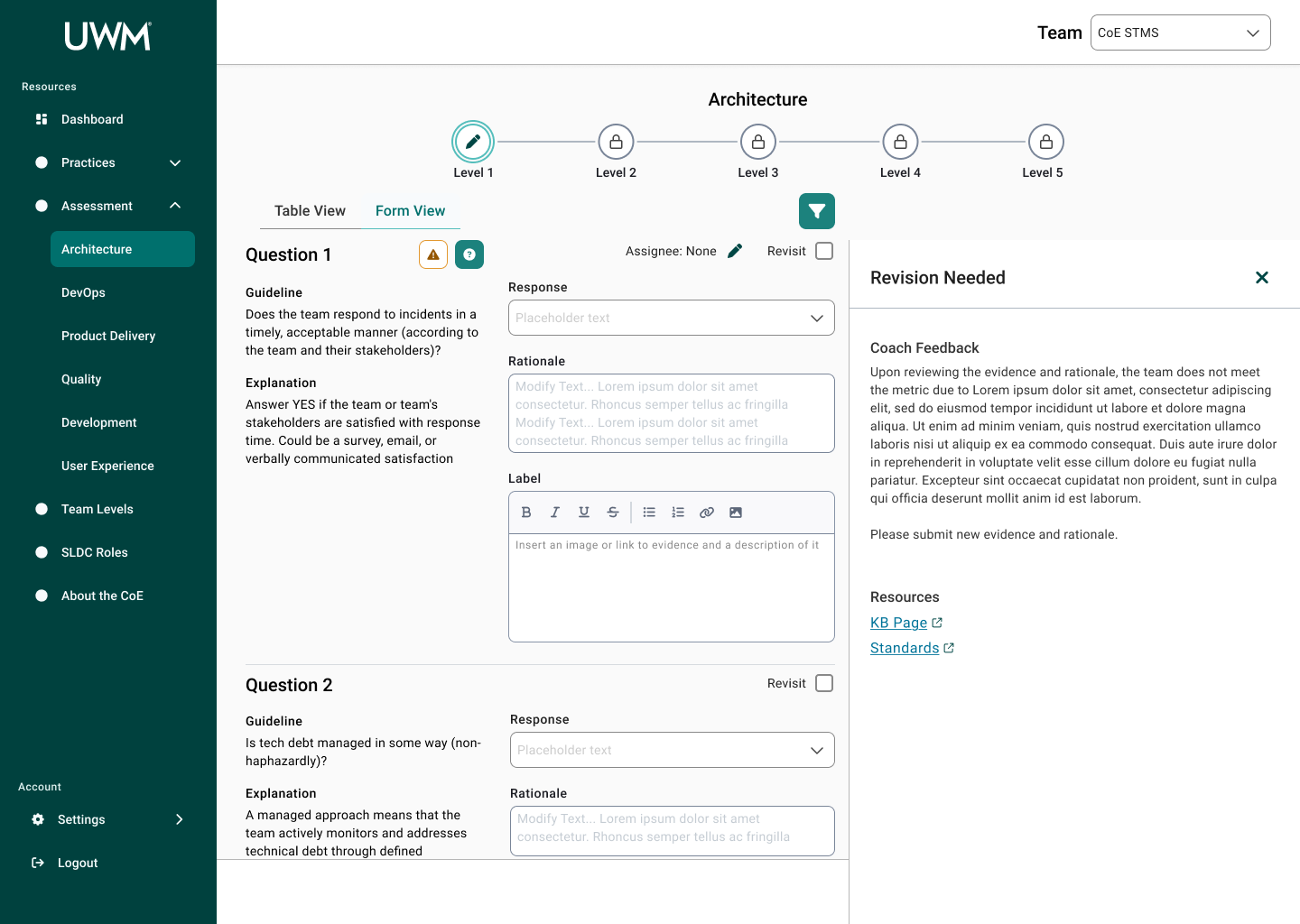
Revision Needed Drawer - houses coaches’ feedback for responses teams submit, previously communicated via MS Teams and emails

Iteration 4
Key Changes
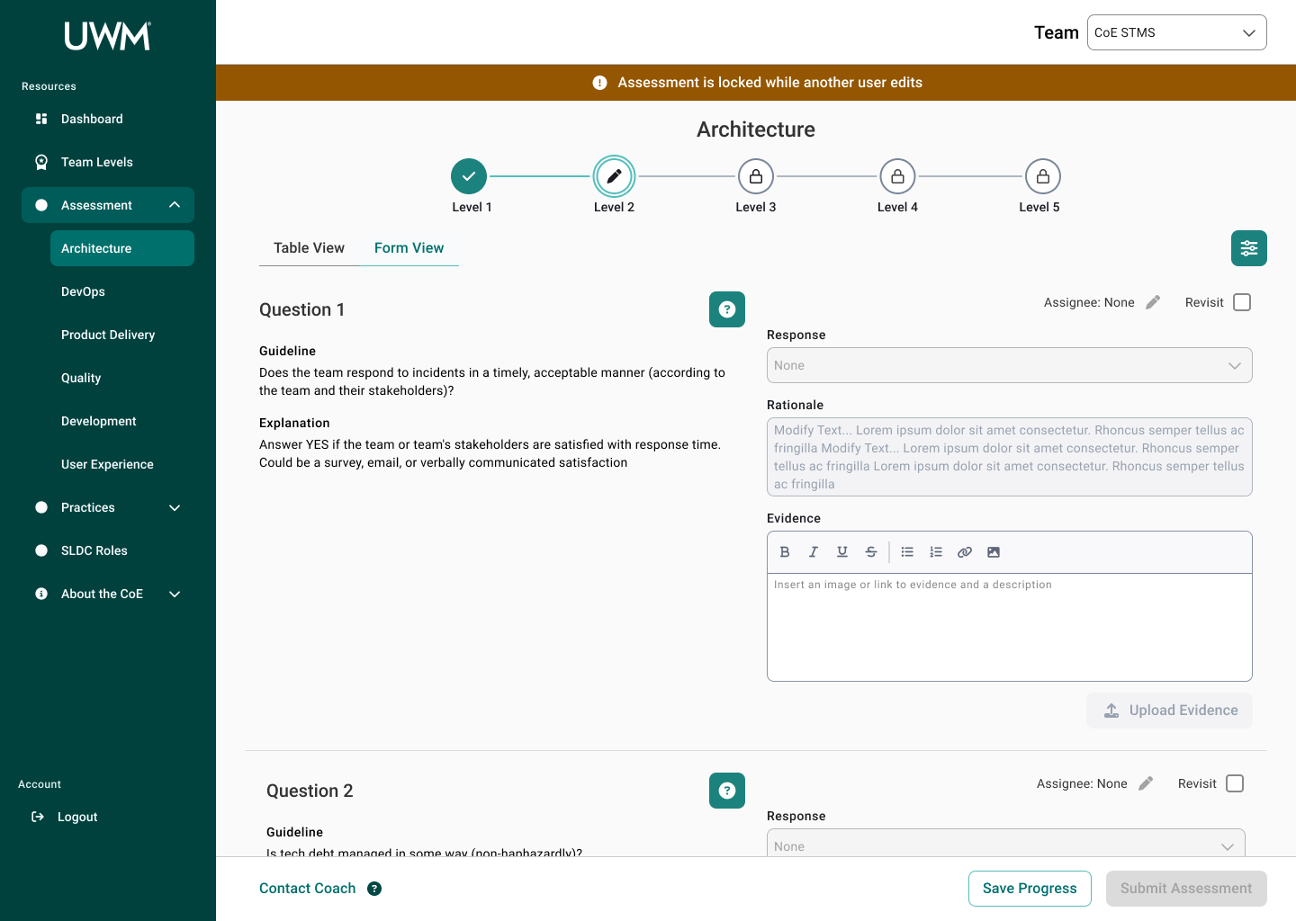
Additional States
Teams have questions to review - previously not implemented
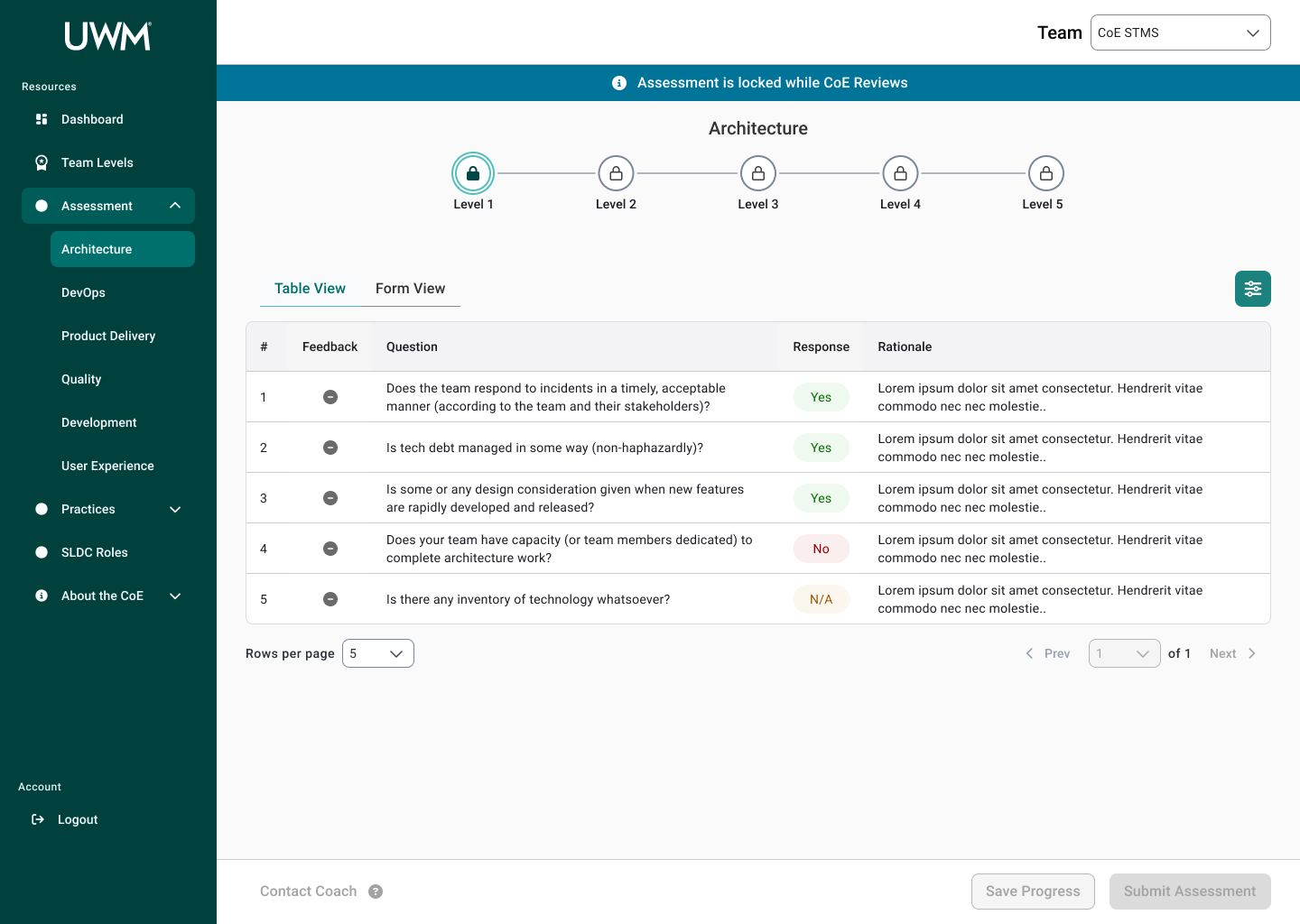
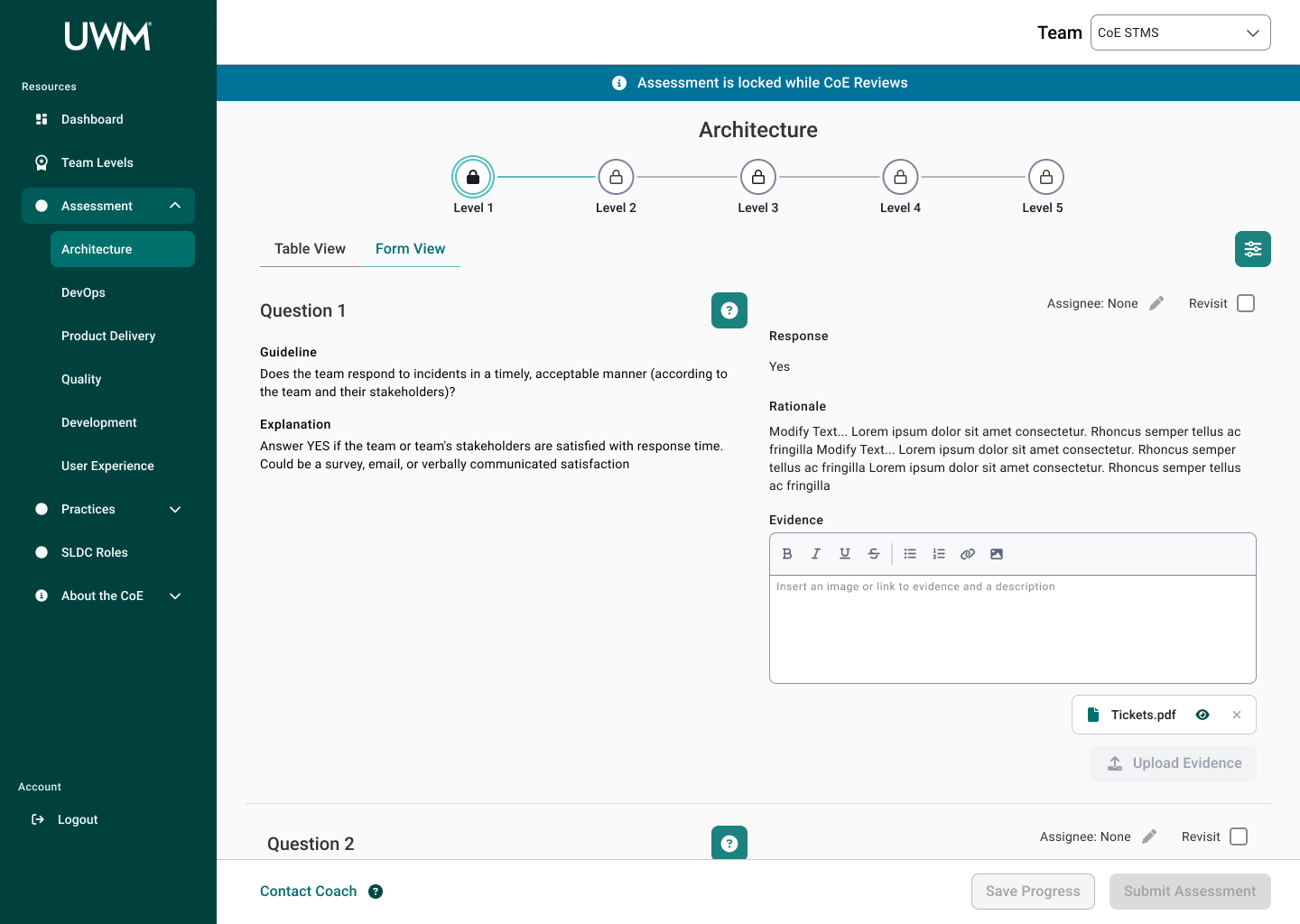
Read-only state for locked assessments - currently, all assessments for all teams are locked rather than individually
Read-only state for another user editing - currently, answers are overridden accidentally by other team members
Locked Level - reduced information and disabled input fields for levels a team cannot answer yet
Feedback Column - quick view to see if coaches have provided feedback for a question and shown in both views
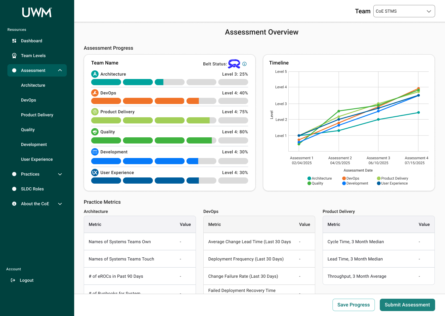
Assessment Home Page - new page that encompasses all practices and provides progress visualizations and assessment history, the latter of which is currently not accessible


05
Test
Once I fleshed out the prototype, I presented the designs to the stakeholders, and I received feedback. Due to time constraints, I could not create a formal usability testing plan and conduct testing. Additionally, due to the collaborative nature of completing assessments, I could not test that aspect. However, I walked through the design with 2 users (1 scrum master and 1 team member) and collected feedback. Based on that feedback, I evaluated the feasibility and determined if I could make the applicable changes. I then updated the designs to reflect the changes before submitting to the design system team to get their feedback.
Recommendations
Revisit Column
Previously, I had missed the column in the table view. One user pointed out that it would be useful to have that in the Table View.
Before
After
Uploading Evidence in Table View
One user cited that they would use the table view more than the form view, so being able to add evidence in the table view would be helpful. However, due to the more complex nature of adding evidence, I chose for the table view to remain a more abbreviated read-only view with some quick actions.
Final Designs
To understand the final designs for Assessment Page with more context, below is a user scenario that follows the journey for completing an assessment based on the research we conducted:
Initial Assessment
Christina is a scrum master for a development team. Her leadership has asked to complete an assessment to determine at what level the development team is performing for each practice. The team has made improvements to their development methods since the last assessment, so Christina thinks they can level up and obtain more badges for further maturity. She was able to complete some of the questions in the assessment in the product delivery practice, but she needs help from some of the other team members to answer the architecture questions. Christina then schedules a meeting with the relevant team members to discuss and complete the assessment.
For the Architecture practice, she hasn’t answered any questions yet, so all answers are blank, and there is no coach feedback yet. She sees a quick overview in the table view, but she then navigates to the form view to start filling out questions during the meeting. In the Form View, Christina looks at the guideline and explanation for the first question. Her team is confused about what the question is asking and what evidence would work. She then opens the clarification drawer. In the clarification drawer, the Architecture coach has provided a bit more context and example evidence other teams have submitted. With this new information and consulting with her team members, Christina can now answer the question. In the rich text editor, she pastes in a screenshot of her survey and adds a description. Once she finishes all the questions for the meeting, she submits the assessment and waits for the CoE team to review her answers. In the meantime, she visits the Assessment home page to see the tentative progress
Post-Feedback
When Christina visits the site again, she sees there is feedback for the questions she submitted previously. She notices there are two questions she needs to revisit. In the Form View, she sees that a coach has made a comment on their answer. She views their rationale and further information through the Revision Needed drawer. Using the information the coach provided, she uploads new evidence for those questions. Looking ahead, she looks at the next levels for Architecture to see what the team needs to be working towards.
SDLC Roles
The SDLC Roles page defines responsibilities of team members for each phase of the SDLC. The page is used for accountability and making sure each team member is taking ownership for their respective activities.
Conclusion
Over the course of this project, I collaborated with many team members, including researchers, designers, and stakeholders to redesign the CoE application for teams to complete assessments to measure their maturity for SDLC standards. This new design will allow teams to efficiently complete assessments, receive coaching feedback, and improve their development practices. In turn, the development teams at UWM can be more cost-effective and time-efficient while also reducing risk.
If there was more time available…
Further Usability Testing
Building a testing plan and conducting formal usability testing would have allowed to gather more robust user feedback
Design Remaining Pages
There are still multiple pages left for the site, implemented them would have created a more comprehensive redesign.
Dark Mode
Users during testing noted the desire for a dark mode, so implementing a dark mode alongside the light mode would allow for greater user satisfaction.
Lessons Learned
Balancing User + Stakeholder Needs
Building a testing plan and conducting formal usability testing would have allowed to gather more robust user feedback.
Larger Participant Pool
Given the diversity of project and IT teams, there are many perspectives to how they use the CoE site. To gain better understanding of the user, I think it would have been beneficial to recruit more participants from a wider variety of teams.
Change is Constant
Throughout the process, expectations and requirements constantly changed. I had to keep an Agile mindset and embrace the changes as they came.
The Last 10% Takes the Longest
Throughout the process of refining my high fidelity designs, I often thought of new user states and edge cases, so I would have to think about how those would work with the designs.